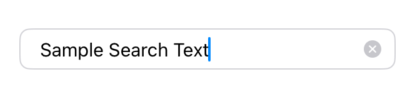
Basic Usage
A simple text field with placeholder text and submit handling. The clear button appears automatically when text is entered.
@State private var searchText: String = ""
@State private var isFocused: Bool = false

SecurableTextField(
    text: $searchText,
    placeholder: "Search...",
    isFocused: $isFocused,
    onSubmit: {
        performSearch()
    }
)
Copied!
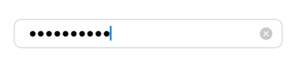
With Secure Entry
Use the shouldSecure closure to conditionally enable secure text entry. In this example, the field becomes secure when the text length exceeds 6 characters.
@State private var password: String = ""
@State private var isFocused: Bool = false

SecurableTextField(
    text: $password,
    placeholder: "Enter password",
    isFocused: $isFocused,
    onSubmit: {
        authenticate()
    },
    shouldSecure: {
        password.count > 6
    }
)
Copied!
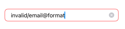
With Validation
Use the isValid parameter to show validation errors. When isValid is false and the field has text, a red border is displayed.
@State private var email: String = ""
@State private var isFocused: Bool = false

var isValidEmail: Bool {
    email.contains("@") && email.contains(".")
}

SecurableTextField(
    text: $email,
    placeholder: "Enter email",
    isFocused: $isFocused,
    onSubmit: {
        submitEmail()
    },
    isValid: isValidEmail
)
Copied!