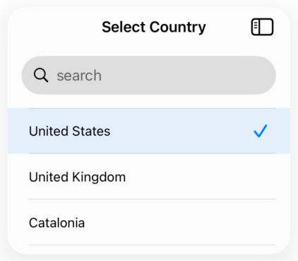
Basic Usage
A simple selector with a list of items. The search bar is enabled by default, and selected items are marked with a checkmark.
struct Country: Equatable, Identifiable {
    let id: String
    let name: String
}

let countries: [Country] = [
    Country(id: "us", name: "United States"),
    Country(id: "uk", name: "United Kingdom"),
    Country(id: "es", name: "Spain")
]

@State private var selectedCountry: Country?

SelectorView(
    items: countries,
    selected: selectedCountry,
    title: "Select Country",
    titleBlock: { $0.name },
    onSelection: { country in
        selectedCountry = country
    }
)
Copied!
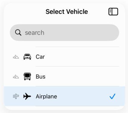
With Icons
Display icons on the left side of each item using leftIconBlock (secondary) or on the right side (primary) using iconBlock. Both can be used together for more complex layouts.
struct Vehicle: Equatable, Identifiable {
    let id: Int
    let name: String
    let iconName: String
    let flagIcon: String?
}

let vehicles: [Vehicle] = [
    Vehicle(id: 1, name: "Car", iconName: "car", flagIcon: "flag"),
    Vehicle(id: 2, name: "Bus", iconName: "bus", flagIcon: "flag"),
    Vehicle(id: 3, name: "Airplane", iconName: "airplane", flagIcon: nil)
]

@State private var selectedVehicle: Vehicle?

SelectorView(
    items: vehicles,
    selected: selectedVehicle,
    title: "Select Vehicle",
    titleBlock: { $0.name },
    iconBlock: { $0.iconName },
    leftIconBlock: { $0.flagIcon },
    onSelection: { vehicle in
        selectedVehicle = vehicle
    }
)
Copied!
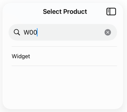
Custom Search Filter
Provide a custom searchFilter closure to implement advanced search logic. This allows searching by multiple fields or custom criteria beyond just the title.
struct Product: Equatable, Identifiable {
    let id: Int
    let name: String
    let code: String
    let description: String
}

let products: [Product] = [
    Product(id: 1, name: "Widget", code: "W001", description: "A small widget"),
    Product(id: 2, name: "Gadget", code: "G002", description: "A large gadget")
]

@State private var selectedProduct: Product?

SelectorView(
    items: products,
    selected: selectedProduct,
    title: "Select Product",
    titleBlock: { $0.name },
    searchFilter: { product, searchText in
        product.name.localizedCaseInsensitiveContains(searchText) ||
        product.code.localizedCaseInsensitiveContains(searchText) ||
        product.description.localizedCaseInsensitiveContains(searchText)
    },
    onSelection: { product in
        selectedProduct = product
    }
)
Copied!
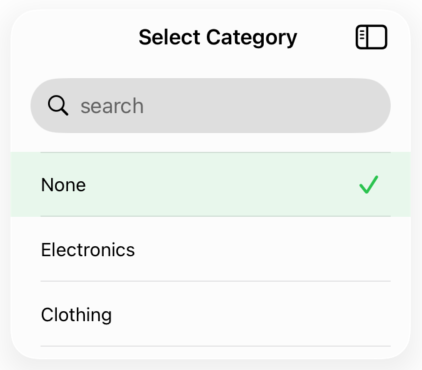
With Nil Option
Add a "none" or "clear" option at the top of the list by providing a nilOptionTitle. This allows users to deselect or choose no option. You can also customize the selected row color using selectedRowColor.
struct Category: Equatable, Identifiable {
    let id: Int
    let name: String
}

let categories: [Category] = [
    Category(id: 1, name: "Electronics"),
    Category(id: 2, name: "Clothing"),
    Category(id: 3, name: "Food")
]

@State private var selectedCategory: Category?

SelectorView(
    items: categories,
    selected: selectedCategory,
    title: "Select Category",
    titleBlock: { $0.name },
    nilOptionTitle: "None",
    selectedRowColor: .green,
    onSelection: { category in
        selectedCategory = category
    }
)
Copied!